
By Brandon Norris
"L on the Rim" Is Almost Never an Error. But There Is a Real One.
The Belief
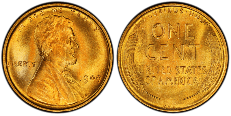
Look at enough Lincoln cents and you will find one where the L of LIBERTY appears to touch the rim, merge with it, or sit on it. Search for it and you will find them listed for sale constantly, and at least one widely shared how-to article treats it as a genuine rim error.
It is almost never an error. And the real reason is more interesting than the one people hope for.
Three Ordinary Things, Stacked
The L sits close to the rim by design. It always did. Look at any Lincoln cent, including an uncirculated one, and the distance is small to begin with.
Die deterioration spreads the lettering outward. As a working die wears through its service life, metal flow pushes the design outward. This is the same mechanism behind die deterioration doubling, where a worn die produces fuzzy, spread-out lettering — and it is progressive across that die's life, so two coins of the same date from different die states will not look alike.
The rim itself flattens and widens. A coin's rim is designed to absorb the brunt of circulation wear and protect the rest of the design. As it does its job it spreads, closing what gap remained.
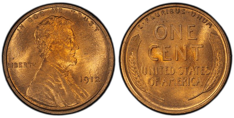
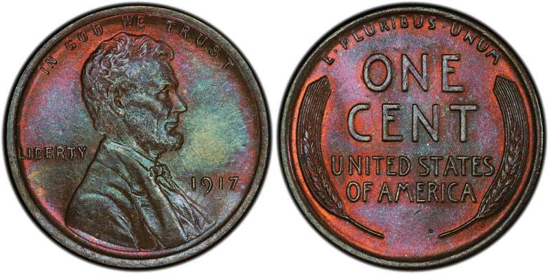
Placement, die wear, coin wear. None of it happens at the moment of striking, and none of it is a mint error.
A correction worth making. A version of this explanation circulating on collector boards
attributes the spread to a single obverse master die used from 1919 to 1968. That cannot be
right. Per James Wiles, the date has been engraved into the master die since 1909, so every
working hub and working die carries that year's date positioning — which means a new master die
every year. The spread is die deterioration, not one die lasting half a century.
But There Is a Real One
Error-Ref catalogues an error called peripheral die expansion and erosion, under die deterioration and deformation errors:
"Radial expansion of the die face, excluding the rim gutter. The field portion of the die face
and the peripheral design elements migrate outward, forming a thin shelf over the rim gutter
that is immediately and continuously eroded. The result is abrupt truncation of the peripheral
letters where they crowd against the design rim."
So the die face genuinely expands outward, the peripheral lettering genuinely migrates with it, and the overhang is continuously worn away.
The diagnostic is not that the letter is close to the rim. It is that the letter is abruptly truncated — cut off flat where it crowds against the rim, rather than simply being near it. Some examples have been found on 1982 Cents with Portions of letters cut off, but none yet of Liberty. Maybe you will be the first.
So What Should You Check?
Not "is my L near the rim." Close is normal.
Is my L cut off? That is the question — and if it is, you have something worth a second look.