Mercury Dimes: The Design Everyone Gets Wrong
It's Not Mercury — It's Liberty
Adolph Weinman's "Mercury" Dime doesn't actually depict Mercury, the Roman god. It shows Liberty wearing a winged Phrygian cap, symbolizing freedom of thought. The wings were misidentified by the public as Mercury's trademark, and the nickname stuck for over a century.
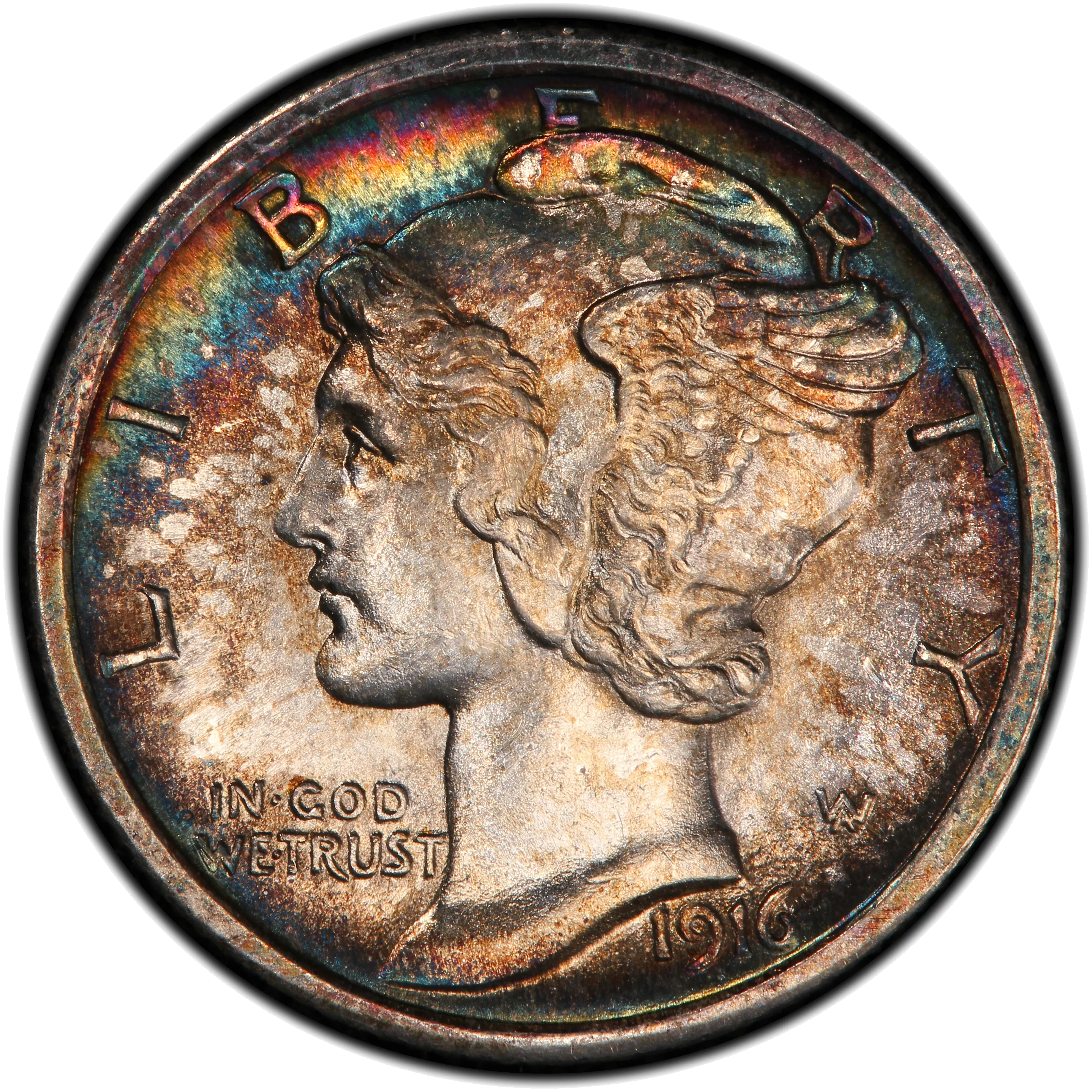
The "Mercury" dime — actually depicting Liberty wearing a winged Phrygian cap symbolizing freedom of thought, not the Roman god Mercury
Weinman's design — which debuted in 1916 alongside his Walking Liberty Half Dollar — is widely considered among the most artistically accomplished in American coinage. The reverse features a fasces (bundle of rods with an axe) entwined with an olive branch, representing military strength tempered by peace.
The 1916-D with its mintage of just 264,000 is one of the most coveted 20th-century coins. The 1942/1 and 1942/1-D overdates are famous varieties. And Full Bands (FB) designation — where the horizontal bands on the fasces are fully separated — commands significant premiums across the series.
The dime series overall spans from the 1796 Draped Bust through today's Roosevelt, with the Barber design (1892-1916) serving the gap between Seated Liberty and Weinman's masterpiece.
Discuss
- Mercury, Barber, Seated Liberty, or Roosevelt — which dime design is your favorite and why?
- Do you chase Full Bands Mercury Dimes? What's the hardest date to find in FB?
- The 1894-S Barber Dime (mintage 24) — will we ever know the full story of why so few were made?
- Is the Roosevelt Dime underappreciated as a collecting series?